Jumat, 30 November 2012

Gill, Wimer, Johnson, Emanuel, Acconci, plus Gaudi for Christmas - it's the December Calendar!

The Holiday Season is upon us.  Some organizations are skipping December, others are having parties, but we still have a full slate for the December Calendar of Chicago Architectural Events.

Cyril Marsolier and Wallo Villacorta, First Prize, Future Prentice competition
Make sure you check out this coming week, because events are heavily front-loaded.  On Tuesday, December 4th, CAF has a panel discussion on Shelter - Design for Social Change, with Roberta Feldman, John Car, Bryan Bell, Sunny Fisher, Patrick Tighe, and Theresa Hwang, the same day Archeworks has its mid-year Design Review and SEAOI has Practicing Green: A Guide to the Structural Engineer as the topic of their monthly dinner meeting, and Glessner House has its 125th Anniversary Dedication Dinner.  Over at Martyr's, there's edition #24 of Pecha Kucha Chicago, with Jordan Mozer, Tess Landon, and Future Prentice design competition winners Cyril Marsollier and Wallo Villacorta among  the presenters.

Wednesday the 4th, lunchtime at CAF, Brian Lee and Ross Wimer of SOM, discuss their Infinity Tower in Dubai and Nozul Lusail Marina in Doha.  Thursday the 6th, all day at the UIC Forum, there's a major symposium:  Metropolitan Resilience in a Time of Economic Turmoil, whose participants include Rahm Emanuel, Pat Quinn, Toni Preckwinkle, the mayors of Columbus, Las Vegas and Pittsburgh, and U.S. Secretary of Transportation Ray LaHood. 

That evening, ULI Chicago presents its 2012 lifetime achievement award to Eugene Golub.  On Friday, Karen Kice offers another curator's tour of the Art Institute's Building: Inside Studio Gang, while AIA/Chicago's Holiday Party and Annual Meeting at Revolution Brewery honors Farr Associates, Matt Dumich, Paul Knight, Vincent Paglione and Lynn Becker.

Wednesday the 12th finds Gordon Gill at CAF lunchtime to talk about AS+GG's next world's tallest building, Kingdom Tower, while in the evening Vito Acconci lectures at the Art Institute, with dining packages available at Terzo Piano.

On Wednesday the 19th, CAF lunchtime closes out its month of heavyweights with Ralph Johnson of Perkins+Will talking about their Universidade Agustinho Neto in Luanda and Women and Children's Wellness Centre in Nairobi.

And starting Friday, the 21st, the year closes out with the Gene Siskel Film Center's holiday tradition of booking Hiroshi Teshigahara's hypnotic documentary Antonio Gaudi.  (and for something completely different, that same week at the Siskel you also get another to check out Leos Carax's audacious Holy Motors.)

There's also Julia Bachrach on The City in a Garden at Garfield Park Conservatory, and Larry Okrent on Chicago from the Sky at both AIA/Chicago and at the Cultural Center for Friends of the Parks. And much more.

Check out the nearly three dozen great items and exhibitions on the December 2012 Calendar of Chicago Architectural Events.


Kamis, 29 November 2012

Early Christmas Gift: Wrigley Building Gateway now Open

click images for larger view
It's been closed since July, the plaza between the two Wrigley Buildings that connects Michigan Avenue to the Trump Riverwalk and River North, forcing pedestrians to take detours a couple blocks away.  New owners hired Goettsch Partners to design a refresh for a plaza that had been allowed to deteriorate.  The textured pavement is in . . .
 . . . and a center walkway, complete with twinkling holiday lights, has reopened the gateway to River North, even while restoration work continues on the terra cotta facades . . .
 new entrances added for add retail and restaurants to be named later.

from September:  Wrigley Building Plaza:  Where Perfect People meet the Rest of Us.
from July:  Back to the Future:  Wrigley Building Plaza closes for rehab.
from August, 2010: Clean Sweep on the Cheap at the Wrigley Building.

Bonus Update: 
The Roosevelt Collection last night announced the retailers signed to fill up the long-empty storefronts.   According to a report by Micah Maidenberg of Crain's Chicago Business, seven tenants have been signed, including an H&M and Z Gallerie, but no Apple Store.
Read -  Frontier Outpost: The Roosevelt Collection and the Future of the Viaduct District

Rabu, 28 November 2012

The white-clad Bride of the Chicago Skyline: Viguier's Sofitel celebrates 10th anniversary with Design Competition

courtesy: bad photoshop
So for the story maybe some of you know, you have the John Hancock, which is a tall, black building, which is the groom, and we like to say that this white building is the bride
That was Nicolas Pesty talking.  He's the General Manager of the Sofitel Water Tower, which celebrated its 10th anniversary on November 14th by announcing the winners of a design competition among students of the School of the Art Institute for which the hotel's architect Jean-Paul Viguier returned to Chicago to judge.
click images for larger view
I have a soft spot in my heart for the Sofitel Water Tower, not just because it's a great piece of architecture, but because we got our start at about the same time.  The sleek hotel opened in 2002.  Later that same year, it featured prominently in my first published work. 
Are We Dead Yet? (it was renamed Stop the Blandness by the time it ran on the cover of The Chicago Reader in January of 2003) was a cry of outrage against the onslaught of mediocre, ugly towers popping up like noxious weeds in the Chicago skyline as part of the construction boom riding the wave of the great condo bubble.  To escape total despair, I wrote about three new projects that might point the way towards a better future:  Robert Bistry's RiverBend, Adrian Smith's Trump Tower, and the Sofitel . . .
It's like the love child of Le Corbusier and Miami Beach's Morris Lapidus, 30 stories of shiny mannerist geometry tapering to a knife edge on the southern end. The main facade, facing Connors Park, is a massive plane in which windows of irregular widths are assembled like a mosaic.  By day they look like blue gray tiles against the opaque white glass facing; by night they're lit and unlit pixels on a dark trapezoidal screen.

Seeing it at a distance, from any perspective, your first reaction is "Wow--what's that?" It's the party guest who stands an inch from your face, gleefully contradicting everything you have to say, and most of what the Chicago School had to say, about how to build a tall building. It's more than a little cocky, a little too in love with itself and its ideas, but behind the bravado is a seriousness of purpose that's in short supply most everywhere else
Yeah, I know, it's a little purple, but still pretty true.  Until Jeanne Gang's Aqua came along a few years later, the Sofitel had few challengers as the most distinctive Chicago skyscraper of the new century.
Designed by Jean Paul Viguier & Associ�s, the Sofitel had Teng and Associates as the local architect of record, with HKL Cladding Systems responsible for cladding a poured-concrete tower with its gleaming  facade of clear and white screen-printed glass panels. The 412 rooms are set in a 33-story, 347-foot high structure that Midwest Construction named one of the best of 2002, citing the challenges of the site, with large existing buildings to the north and west.  Seven by-seven-foot girders on the sixth floor were used to transfer loads over a base building holding the lobby and 4,500-square-foot ballroom.  Along the southern "prow" edge, no two glass panels are the same.   Tower and base were "delinked" with a four-foot-wide pour strip that was cast into a flood slab which drew any settlement cracks to it from the rest of the building.
As described on Viguier's website, the building . . .
. . . had to meet three main needs: open the hotel�s public spaces onto the city, create volumes that would complement the horizontality of these public spaces and the verticality of the rooms, and, last but not least, create an emblematic building in this architecturally legendary city.
The tower therefore takes the form of a right triangular prism sitting on a base plate, with a �prow� sliced into by a virtual cone. The prism generates a generally triangular floor plan, avoiding the impression of never-ending corridors that often blights hotels of this type. The base plate containing the lobby, restaurants and conference rooms opens onto a small elliptical plaza formed by the �cut�, home to the restaurant�s terrace and the entrance canopy.
The prow leans out over the street, affording spectacular views from the rooms and, as a small architectural gesture, creating an iconic presence in the city.
This presence is reinforced by the facades, whose alternating strips of clear or white screen-printed glass bring a splash of light to the darker surroundings. The base plate and prism facades facing the elliptical plaza are glazed to their full height with clear glass highlighting the point where the virtual cone �cuts� into the prism.
As the Water Tower hotel's 10th anniversary approached, Pesty said Sofitel realized. . .
. . . we have to do something that is really meaningful.  Meaningful for Sofitel, because Sofitel as a brand is very attached to architecture and design, but also meaningful to the city of Chicago.  We had to find a partner, and we had an excellent idea to partner with the Art Institute of Chicago and we had a great collaboration.  We organized that content and I think it was the best way to recognize the craftsmanship of the students to do this event tonight.
jury: Jean-Paul Viguier; Carlos Martinez, SAIC, Gensler; Annick Colybes, journalist, co-founder of d�Urba-Presse; Garret Eakin, SAIC/AIADO member; and Fran�ois Lamarre, architect, published author and journalist (Not pictured: Carl Ray Miller, SAIC MAarch graduate programs director.)

photo courtesty Pierre-Yves Rochon
 The Sofitel's interior designer Pierre-Yves Rochon, also on hand at the anniversary event, observed . . .
. . . The architecture of the future will be with the woman.  And that is very good news.  In our place, we are over 65% women, so this is why I'm so impressed tonight the jury chose three women.  It's beautiful architecture you did.  I would like to tell you that. For me, the interior design was just not to destroy the architecture of Jean-Paul Viguier.  That was my main concern.  And also to [bring] French interior designer to the capital of architecture in Chicago.
 Under SAIC/AIADO professor Anders Nereim, 13 students created designs for new hotels in three locations:  Helsinki, Mozambique and Lima. Here, Jean-Paul Viguier discusses the hotel and the competition, and announces the winners.
First prize co-winner Sarah Barrett:

First prize co-winner Sara Alzaward:
Honorable mention winner Mikyoung Chang:
The first prize came with a $1,000 prize and a 5-night stay in any Sofitel property.
The Sofitel Water Tower was built for $73,000,000.  According to Wall Street Journal report, it sold in 2006 for $105 million to a trio of investors that promptly loaded it up with $160 million in mortgages.  When they had trouble re-financing the debt this summer, the property was acquired by the massive Blackstone Group, which owns 185,000 U.S. hotel rooms.  Throughout, and into the future, Accor SA manages the hotel as part of its global Sofitel brand.

Not long after its opening, the Sofitel was named "Best New Chicago Building in Last 10 years" by AIA/Chicago.  It continues to hold its own as one of the finest and most distinctive contributions to continuing glory of Chicago architecture.

Thanks for the Views, Mr. Mies - one more event for November

We're pretty sure this will be the last event we add to the November Calendar of Chicago Architectural Events.

This Thursday at 6:00 p.m. at the Graham, co-authors Danielle Aubert, Natasha Chandani and Noah Resnick will be discussing their new book, Thanks for the View, Mr. Mies, Lafayette Park, Detroit, which documents Mies van der Rohes enduring housing complex with both interior and exterior photographs, and interviews with homeowners, tenants and staff.  More information here

Selasa, 27 November 2012

From drugs to dollars to deli: the story of Walgreens and the landmark Noel State Bank

click images for larger view
This is a story that has come full circle.  It's about a man who made a fortune manufacturing patent medicines and founded a bank, who built a grand building for that bank, and, not long thereafter, watched that bank fail, and the grand building pass from his hands, to ultimately stand empty and abandoned, until . . .
Now that grand building, constructed as the Noel State Bank, at 1601 North Milwaukee, has found new life as a flagship store of the same Walgreens corporation that, itself, began in Chicago in 1901, when a young Charles Walgreen opened his first pharmacy in Barrett's Hotel in the neighborhood now known as Bronzeville, with the idea, not unlike that of today's corporate leaders, of reinventing the drugstore.

Theophilus Noel
Joseph R. Noel was born in Texas in 1872, the only son of a father who, himself, had assisted his own father's medical practice in Niles, Michigan.  Joseph's father, Theophilus Noel, was a Confederate solider who ran messages to the Union generals for Robert E. Lee.  Before he left Texas, he made a small fortune during an oil boom selling drilling rights to his property to speculators convinced there was oil on the land even when Theophilus knew there was not.   But Theo did discover "a certain mineral substance containing valuable medicinal properties, deposited at a locality termed Damon Mound, in Brazoria county in the State of Texas, and spent many years in experimenting with the said mineral substance with a view of providing a merchantable article as a medicine for divers ailments and diseases."  In 1886, Theo began selling it in powder form as Vitae-ore, "Nature's Doctor for Mankind!", a curative for everything from Rheumatism and La Grippe, to Female Complaint and General Debility.
Sold through advertising vigorously argued, Vitae-ore became a great success.  Young Joseph R. Noel attended Chicago's Rush Medical College and became a doctor, but he ended his practice in 1897  to manage his father's business.  On October 28, 1905 he took on banking, establishing the North West Savings Bank on the site of the current Northwest Tower.  Joseph was sole proprietor of the bank until 1909, when it was incorporated under state charter.  In 1917, the name was changed to Noel State Bank "in order to avoid confusion, as there were five other banks with 'North' in their names."
With deposits nearing $4 million, Noel commissioned a new structure for the bank on a site just across the street. It was designed by Gardner C. Coughlen of Weary and Alford to be "the dernier cri in bank architecture in Chicago. . . The exterior will be in the classic Corinthian order based on the best Roman examples . . . " Exclusive of site, the cost was $400,000. It was completed in 1919.  Theo never saw it; he died the year before, age 77.
Revival-style, the design of the bank expresses an image of permanence and security.  The exterior is clad entirely in ornamental terra cotta.  Large windows are divided by engaged pilasters topped with Corinthian capitals, and a prominent cornice wraps around the rounded corners of the building
Just as the Northwestern Trust and Savings was described as a Polish bank, Joseph's was described as "the Jewish Noel State Bank." The grid of the enormous ceiling resolves into six-point Stars of David.
Like so many neighborhood financial institutions that built grand edifices for themselves during the boom of the 1920's, the Noel State Bank was done in by the Great Depression.  It closed, at the request of its Board of Directors, on June 18, 1931, following several runs that had reduced deposits by almost half in less than two months.  Joseph R. Noel died, at his Evanston home, in 1940. The building became Fairfield Savings, and then Midwest Bank and then, in 2005, empty, which is how it remained with the exception of rare events such as a party thrown by Nike in 2010. 

"We spent from March of 2010 until June of this year rehabilitating this building," says Mike DeFazio, Walgreens Senior Director of Store Concepts.  "We cleaned it, restored it back to the original look.  The lighting is all original lighting.  We restored it all.  We pulled the skylight out, sent it out and had it resorted back to its original specifications."
Wicker Park is the fifth Walgreens "flagship" store.  Another opened at State and Randolph earlier this year, with others in Las Vegas, Puerto Rico and a Duane Reade flagship at the 1930 40 Wall Street - renamed The Trump Building - in what had been a long-closed, classically styled, 28-foot-high former main transaction hall for the Bank of Manhattan.  "If you know anything about Donald Trump," says DeFazio, "you know he's very particular about what he does with his property."  [In Chicago, he's left the retail portion of the Trump International Hotel and Tower riverwalk empty for years awaiting tenants that meet his standards.]

"He allowed us to put a Duane Reade inside of one of his buildings," continues DeFazio, "but it's done in a way that it protected the architecture.  And it created an atmosphere that was OK for his building.  And that says something, because he's very particular."

Mike DeFazio
The flagships are incubators for innovation.  "We think," says DeFazio, "that, especially in urban environments, we can be a more significant player in the convenience side of the business.  It's not that we want to do less pharmacy business - we want to continue to grow our pharmacy business - [but] this kind of tells people we're different.  We're not just a drug store anymore.  Now we're a health and living destination for everyone in America.  We don't say "drug store" anymore.  We say health and deli living destination.  That's the kind of message we want to send out.  The look and feel and the content and relevance is going to be dedicated to where that store is located."

The most radical part of the Walgreens at Noel State Bank is not the added emphasis on pre-packaged foods and other convenience products.  It's that there simply wasn't enough space on the main floor, however huge, to hold all the product, so categories have been split up.

"Usually beauty and health are together, "explains DeFazio.  "Convenience [the category] always has to be convenient.  Otherwise we'd have to call it something besides convenience, right?  And it's always usually with cash [checkout], so wherever cash is, we usually have convenience.  If you look at a prototypical Walgreens, you go in through beauty, you cycle through health, you come out through convenience, you pay.  It's kind of a round store, right?"
"This is the first time we've separated beauty and health.  We dedicated an intimate beauty situation upstairs for women.  We have all of health and personal care on the lower level with the pharmacy. This is a test for us.  We're going to see how it works."

"Total box is 29,000 square feet and change.  Selling square footage is about 19.  We break it out three ways,  This is about 11,000 square feet on the main level, the upper level's about 4, downstairs is the same size, but half of it is stock area.  That was driven by the vaults that are downstairs.  It was just cost-prohibitive to take them out."  One of the vaults is used for storage.  The other has been pressed into service as the "Vitamin Vault", with a display of old products along the wall of safety deposit boxes.
photo courtesy of Walgreens
The mezzanine  is "beauty," the basement is "health", designed to not look like a basement through a very open escalator bay and lighting that looks like a skylight over the center aisle.
The pharmacy, in the back, combines tradition and innovation.  Customers can use the web to refill prescriptions and pick them up at a assigned kiosk, and the pharmacist is no longer stuck behind the counter, but sits at an open desk in a more informal setting.  Three window displays along the back wall of an adjacent seating area hold a collection of historic packages. 
"This is all from the Walgreens Historical Foundation," says DeFazio.  "We have thousands of items, and I'm going to use all of it at some point.  It's just sitting in storage cabinets. It's a shame.  I think it's a great visual presence to talk about our history. "

The new flagship makes the building's history an integral part of the design.  An original blueprint and other drawings found in a box discovered tucked away in the basement have been framed and put on display, as is a passbook from the original bank.   Vintage photographs are mounted just below the ceiling of the Vitamin Vault.

Dan Garneau
And then there's the spectacular main hall, which has been passed down through the decades remarkably unaltered. A thick layer of grime seems to have sealed it off from damage.  Most of the heavy-duty rehab work was in areas the public will never see.

Dan Garneau, the Regional Development Manager who was the company's architect on the project, explains:

"Our building wall is right on the property line.  It's a vaulted sidewalk, and the vault continues into our lower level.  Part of our space is the vault underneath the city sidewalk.  Water was coming down into the vault.  We had a lower level that was basically an empty shell of space, unused for anything apart from storage and mechanical.  The last tenant was Midwest Bank.  They used the area in the vault - a very small area - and then sort of left the rest of it go to nature.  So we had extensive structural work needed to make sure the vault was secure.  A lot of waterproofing.  A lot of drains and drain tile."
The building is an official designation, so the architects had to work closely with the Commission on Chicago Landmarks on the rehab.  Garneau was allowed to remove a non-contributing stairway in the middle of the sales floor leading down to vault, but the small windows at the base of the walls were another story.  "We actually asked," recalls Garneau, "if there was any way we could enlarge some of the windows, and they said, no, we don't want to change anything that's exterior to the building, and we said, OK, we understand.  We're just gathering information."
photo:  Google Maps
"The skylight is original to the building.  That's something we took piece by piece and restored and put back in.  Between the ceiling and the roof there's about six to eight feet of interstitial space.  It's where the catwalks are that they used to change all the lights.  And it's also where the support for the ceiling is.  It's thousands of wires that attach to the plaster ceiling and support it.  It's hung from the roof trusses.  Above the skylight in the ceiling there's actually a domed skylight on the roof that lets the light down.  The light you see is the actual sunlight."
"We had the one pilaster at the end, the capital is plaster recast.  The rest are all original.  The pilasters are terra cotta.  The ceiling is all plaster.  The ceiling we just had to clean.  The paint is original to the ceiling. "  The interior terra cotta was finished to look like stone, and some of that finish had to be re-applied, using profiles from that box they found in the basement.  Unobstrusive circular diffusers were added just below the ceiling for ventilation.
In some ways, the original design is very modern.  The white terra cotta exterior is simple and restrained, and the bulk of the interior is a single bravura space, completely unobstructed, within a glass-filled envelope whose massive windows bring the outside in, much as a curtain wall would do.
The ornamental elements of the ceiling are framed in a strong geometry.  The shelving and furnishings sit lightly within the dramatic backdrop.  They inhabit rather than obscure.  The tension between old and new finds a comfortable balance.  Walgreens has taken heat for destroying historic buildings for new construction, but at Noel State Bank, they've arrived at a very graceful solution that celebrates the historic urban fabric even as it pushes it forward.


Senin, 26 November 2012

Judith Russi Kirshner resigns as Dean of UIC College of Architecture and the Arts

UPDATE: [January 15, 2012]

From today's press release:
The Art Institute of Chicago is pleased to announce the appointment of Judith Russi Kirshner as the museum's new Deputy Director for Education and Woman's Board Endowed Chair following a national search. In this newly created position, Kirshner will evaluate all of the museum's educational efforts, collaborations, and partnership programs, and work across the museum and the city to shape a future-oriented and holistic approach to education, outreach, programs, and audiences. Kirshner's appointment reflects a renewed and systematic effort on the part of the Art Institute to expand the museum's audience, enrich the experience of all visitors, and improve access to the museum's renowned collections and exhibitions. She will assume her new position at the Art Institute on March 1, 2013. 

Original post [11/26/2012] In a press release issued late this afternoon, UIC announced that Judith Russi Kirshner is resigning as dean of the College of Architecture and the Arts as of December 31st.  Kirshner has been in the post since 1998, following a year serving as interim dean. It was under Kirshner  that Robert Somol was named Director of the School of Architecture in 2007. Kirshner will remain a member of the faculty.  Full text of the press release after the break.


Dean of UIC College of Architecture and the Arts Stepping Down

Judith Russi Kirshner, an internationally recognized arts scholar and advocate, will resign as dean of the College of Architecture and the Arts at the University of Illinois at Chicago effective Dec. 31.

"Professor Kirshner has been a dynamic leader and advocate for the mission of the college and UIC," said Lon S. Kaufman, vice chancellor for academic affairs and provost. �Her legacy will be long, rich and significant. In over 15 years as dean, Professor Kirshner has transformed the college into a nationally and internationally recognized leader for education in architecture, design, and the arts.�

Kaufman praised Kirshner's "continual re-evaluation and strengthening of the college's academic programs and academic leadership structure to build the strongest degree programs possible,� citing in particular the impending reorganization of the college. A newly organized and renamed College of Architecture, Design, and the Arts, with four restructured academic schools (Architecture, Design, Art & Art History and Theatre & Music) will become official next August.

Kirshner became dean in 1998 after a year as interim dean. Under her leadership, the college received grants from the National Endowment for the Arts, the National Endowment for the Humanities, the Graham Foundation, the Driehhaus Foundation, the Illinois Arts Council, the Polk Brothers Foundation, After School Matters, and the Chicago Community Trust. Kirshner also led the campus effort to bring a public sculpture -- the UIC Skyspace, by artist James Turrell -- to UIC�s South Campus, and she led the initiative to identify and make accessible the Campus Art Collection, which houses the work of many outstanding UIC faculty artists. As an academic leader, she has kept programs contemporary and has worked with external donors to bring in funding for student scholarships and programmatic support.

Kirshner joined UIC in 1990 and served as director of the School of Art and Design until 1997. Prior to that she was at the Museum of Contemporary Art in Chicago, where she was curator; at the Terra Museum of American Art; and in the art history department of the School of the Art Institute of Chicago. A critic and curator, she is a recipient of the Warhol Foundation Award for Criticism. Her scholarship and publications focus on contemporary art, in particular Italian artists and feminist movements, and she lectures frequently. She is a member of the advisory board of the City of Chicago Department of Cultural Affairs and Special Events and many other advisory boards of national and Chicago cultural organizations.

Kirshner will remain a member of the UIC faculty after stepping down as dean. A national search to select a new dean will begin shortly.

A Theater Vanishes: The Two McClurgs

click images for larger view
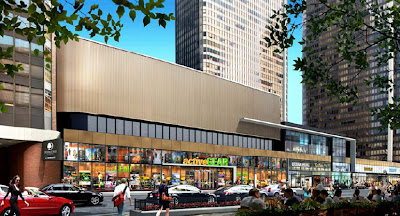
A walk down Ohio Street this past week reminded me of something I already pretty much knew:  the McClurg Court Cinemas are gone forever.  They've been closed, of course, for nearly a decade, but you always knew that behind that closed box office, the theater, itself, endured.  Now that original facing, all long Ohio, is in the final stages of being replaced with a new design intended to bring new retail to the complex, including in what is now the gutted space that was once the theatre.
Although state-of-the-art with its 70 mm projection and advanced sound system, the 1,200 seat McClurg Court led an uncharmed life.  It opened in 1971, with a roadshow premiere of Norman Jewison's film version of Fiddler on the Roof, at the very moment that kind of reserved-seat booking - and the long era of new movies opening in exclusive runs in downtown movie palaces -  was already reeling towards extinction.  While Fiddler was a success, it's next two bookings - Man of LaMancha and Lost Horizon - were not.  It's last major hit was Last Tango in Paris, back in 1973.  In 1987, the balcony was split off into two additional theaters.  The main auditorium downstairs, however, remained one of Chicago's largest screens,  It benefited, briefly, from a 1990's fetish for taking 35mm action blockbusters and blowing them up into 70mm prints.
The McClurg remained one of the best places to see films in the city, and one of the last capable of showing 70mm, including the stunning restorations of Lawrence of Arabia, My Fair Lady, and the VistaVision Vertigo.  It did little, however, to arrest the theater's descent into seediness.  The year after the AMC-21 opened a couple of blocks away, the McClurg closed forever. Now, the Music Box is the only Chicago house capable of screening 70mm, but considering the fact that we are probably only months away from never again being able to see so much as one of the entire first century of films projected on the same medium on which it was shot, that may no longer even matter.  We have entered an era where film is dead, and digital projection is the only projection.
In a promotional brochure, the owners of McClurg are indicating they hope the gutted theater space will now become home to a 15,000 square-foot retail anchor, with as many as seven additional stores in a row down Ohio.
Courtesy the Chuckman Collection
The other interesting story about McClurg Court Center is how it links up to one of the greatest - and least known - landmarks in Chicago: Holabird and Roche's McClurg Building on south Wabash.  When McClurg Court Center and its 1075 apartments was sold for $127 million back in 2006, the sale excluded the land beneath the complex.  That land is still owned by the heirs of Alexander C. McClurg, whose history with Chicago goes all the way back to his arrival back in 1859.
Forgotten today, McClurg created not only one of Chicago's most successful bookstores, but the largest book distributor in the west.  He was the first to publish Edgar Rice Burroughs' Tarzan series of adventure novels, and the founder of the late 19th century literary magazine, The Dial.  When McClurg's five-story building at Wabash and Madison burned to the ground on February 12, 1899, at a loss of $500,000, his first impulse was to see this as a good opportunity to retire. Instead, he re-capitalized the business with $600,000 of stock - much of it offered to employees - and he made a new home in a spec office building that had just been built by a Boston developer.
The new Ayer Building at 218 South Wabash was renamed the McClurg Building.  The nine-story structure, designed by architects Holabird and Roche, is a small temple of Chicago architecture, its modernity found in the 9,000 square-feet of glass between spare terra cotta spandrels and columns, engineered to suck every last ray of available sunlight deep into the long, narrow structure.  Like Atwood and Burnham's Reliance Building, now the Hotel Burnham, the McClurg is a classic glass box a half-century before Mies.  Today, decrepit and unloved, it still looks more strikingly modern than the new applique on its namesake brethren a mile to the north