Sabtu, 02 Agustus 2014

Play With My Feet, Magritte

Imagine if you will, coming out of Lake Michigan after a swim at Oak Street beach.  The sun is warm. the sand hot.  Your eyes slowly adjust to the glare when, suddenly, you see it - a pair of huge silvery feet that turn . . . into boots.
click images for larger view
No, you haven't been stung by a rabid zebra mussel.  It's not the latest experiment in genetic engineering, or even a commentary on Hanig's Footwear being forced from their flagship store.
It's the latest inspiration from Chicago ad agency Leo Burnett in their ambitious Unthink campaign promoting the major retrospective, Magritte: the Mystery of the Ordinary, 1926-1938, which runs at the Art Institute through October 13, 2014.  The strategy is to bring surrealism to Chicago locations other than the City Council chamber.
We've already written about the Unthink Voyeurism mural painted on the roof the Art Institute's Morton Wing, where the most surreal component is not the content of the mural but the fact that it's invisible to everyone not in a nearby tall building or airplane.
The feet at Oak Street Beach are seven feet tall, made out of plywood and carved foam, hard coated in urethane.  Each one weighs 800 pounds..  They're a re-imagining of the pair in Magritte's 1934 painting Le Model Rouge, blown up to Oldenberg proportion.  The AIC press release says they were the artist's �way of calling attention to the fact that we often cover our own flesh with dead animal flesh.� Unlike at the beach, where we uncover our flesh with plant fabric over the naughty bits.
According to the Trib, da feat is expected to stay at Oak Street until mid-month, after which they're expected to stomp down somewhere along Michigan Avenue.
Unlike the rooftop mural, accessible only to the maintenance staff, the Big Feet are doing a pretty good job of engaging beachgoers, skillfully engineered for climbing with shoelace ladders.
Theater on the Lake may have been exiled from its waterfront venue for the season, but urban theater on the beach is alive and well at Oak Street.
 And now, your Ozymandias moment of Zen . . .


Kamis, 31 Juli 2014

Short Division

photograph: Bob Johnson (click images for larger view)
It stood for over a century, and was gone in an instant.
Constructed in 1903, the East Division Street Bridge over the North Branch Canal at Goose Island was the direct result of the investigations of Chicago City Engineer John Ericson to find an alternative to the city's traditional swing bridges, whose center piers had become navigational hazards as commercial traffic on the river intensified.   Inspired by London's Tower Bridge of 1894, Ericson and his team came up with what became known as the double-leaf bascule, with two movable segments raised and lowered by motorized equipment at each bank, leaving the center of the waterway unobstructed.
photograph: Library of Congress
The bridge at Division, designed and built by Jules E. Roemheld and John J. Gallery, was one of the first to follow this new design strategy, replacing a swing bridge that had been constructed in 1870.   240 feet in total length, each of the two leafs was supported by 101-foot-long steel trusses. (You can read more about the bridge's history on the indispensable  Historic Bridges website.) When fully opened, it freed up a clear channel 80 feet wide. Instead of the usual sharp-angled end structures, those on the Division Street were arched, resulting in the bridge being bookended at either end by graceful rounded curves.
photograph:Bob Johnson
The National Park Service's Historic American Engineering Record on the east Division Street Bridge noted how �since the movable leaves were counterbalanced, relatively little power was required to open and close the bridge . . . a single, direct-current, 75-horsepower motor mounted, along with the rest of the lifting machinery, on an inclined steel platform spanning the abutment and first pier beneath the approach roadway.�
photograph: Library of Congress
Work began on the bridge in June of 1900. Roemheld and Gallery had secured the right to build it with a $133,000 bid.  Problems with leakage resulted in the coffer dams having to be rebuilt, and additional excavation punctured a water tunnel under the canal.  The bridge was finally opened to traffic in February of 1903, at a final cost of over $194,000.
For much of its life, the area around the bridge was home to coal and lumber yards, and during World War II the bridge again proved its worth as river traffic boomed.  After the war, however, shipping entered a steep decline.  The coal and lumber yards closed down, leaving vacant land.  By the 1970's, the city called for closing many bascule bridges that were seldom lifted and expensive to maintain.  The East Division Street bridge rose for the last time in the 1990's.  $6 million has been budgeted to demolish the bridge and replace it with a �temporary� span.

I was at the bridge on the morning of May 16, 1992, when legendary Chicago author Studs Terkel was joined by Mayor Richard M. Daley, Mike Royko and others in dedicating the bridge to the author whose landmark book, Division Street: America chronicled the thoroughfare as a microcosm of Chicago history.  The bridge was re-dedicated in 2012, in what would have been Terkel's 100th year, and there's already a move afoot to make sure the replacement bridge also bears his name.
No one ever mistook the East Division Bridge for a romantic construction, but there was a surprising bit of ornament.  Along the steel of the bridge's overhead bracing, there were repeating punches of the Chicago �Municipal Device�, the Y-shaped civic symbol that represents the merging of the three branches of the Chicago River at Wolf Point.    Their use on the structure can be seen in Urban Remains Eric J. Nordstrom's documentation on the destruction of the bridge here, here, and here.
As has been a constant since the 19th century, funds for maintaining the city's infrastructure were often been sparse, and time had not treated the East Division Street Bridge kindly, with major renovations widely spaced in the early 30's, 1969, and then again in the 1980's. Recently, it's members had been painted pink.  In April of this year, trucks and buses were prohibited, and on June 30th, the bridge closed to traffic for the last time.
As can be seen at the photograph at the top of this post from our indefatigable correspondent Bob Johnson, the wreckers made quick work of it.  By the time I got there it little more than a week ago, the imposing metal structure that had dominated the view down the channel for 117 years had completely vanished.  You could almost imagine it had never existed, if it weren't for those giant concrete moorings on either bank, standing like some mysterious ancient ruin whose meaning still awaited deciphering.

Rabu, 30 Juli 2014

Finding Jane's Place at Water Tower Park


click images for larger view
The official name - Jame M. Byrne Plaza - while appropriate to the office that brought her fame, is far too formal for the plaza around Chicago's Water Tower.   If the ending of her single term as mayor brought disappointment, it's beginning brought a total upending to Chicago's sclerotic political order. Yes, she was the first - and to date, only - female mayor of Chicago, but in the way she stormed through city government, at one point taking up residence in one of the high rises in the dreaded Cabrini Green complex to show solidarity with its residents, showed her to be a people's mayor.

So once they make the park's new name official, let's all make it personal.
Someone else came up with the idea, but �Jane's Place� it is, just as it was when she was able to see it from her kitchen window at One East Chestnut.  
Steeped in history as the greenspace around the 154-foot-tall 1869 Water Tower, the �castellated monstrosity with pepper boxes stuck all over it�, which began as a landmark and grew to a legend after it survived the Great Fire of 1871.  The park stood on watch as the sleepy neighborhood around it grew into the Gold Coast, the lake receding behind block after block of new landfill, and then, after 1980's death of the Loop as Chicago's main shopping drag, became the pulsing heart of the new center of the city.

This is the people's park, a place for just sitting and watching the throngs go by.  A place to celebrate the Christmas holiday . . .
. . .and a place just for flopping out . . .
 . . . and for protests . . .
. . . and for weddings . . .

. . . lots of weddings, that most optimistic of public rituals . . . 
The Chicago City Council to expected to ratify the renaming for the now 80-year-old Byrne today.   It will all be very dignified, encased in the formal prose of resolutions.  Well and good.  But there was a lot more to the person they honor.  Jane Byrne was ambitious, uncertain, decisive, rambunctious and passionate.  That's the personality of the public space that will now bear her name.  �Jane's Place� it is.


Senin, 28 Juli 2014

What's red and blue and on a mezzanine? CTA's new Division and LaSalle entrance debuts

click images for larger view
If you encounter it in the just the right place, you might feel you've fallen into the blood elevator scene from Stanley Kubrick's The Shining. The crisp red tiles of the new entrance mezzanine at Division and LaSalle - the first anywhere along the Red Line subway since it's opening seventy years ago - just have a way of burning their way into your retina, a strong navigational focus point that leads you to the escalator, stairs, and elevator to and from the platform.

The station's original entrance at Clark and Division is now temporarily closed as it also undergoes a major rehab for the first time since its opening in 1943.  Back then, it was more of a workaday neighborhood.  According to the station's history on the essential Chicago-L.org, there was even a direct mezzanine-level entry to the Mark Twain Hotel(!). As the surrounding neighborhood first sank and then went more and more upscale, the original crisp design of the station became increasingly derelict, leading Tribune transportation report Jon Hilkevitch to label it �among the tackiest and most dilapidated on the CTA system.�

A 1999 plan had a $15 million price tag, but the time the issue was revisited a few years later, the budget had exploded to $102.5 million.  A new design was completed in 2011, but $30 million in funds earmarked for Clark and Division were diverted to cover the $67 million cost of rehabbing the Red L stop at Grand. By the time the project was relaunched in 2012, the cost was cut almost in half, to $50.6 million, largely by not trying to keep streets open during construction, but shutting down Division for a year, simplifying the construction staging.
The new 8,800 square-foot mezzanine at Division and LaSalle actually opened two months ahead of schedule, at the end of June.  The worst part of it are those truly abominable giant sea slug street entrances to which the CTA seems addicted.    Lumbering, over-scaled, thick limbed and graceless, anything farther from the classic, spare elegance of Chicago design would be hard to imagine  At least on the northeast corner, there's the lightness of the Richard Haas to provide an ameliorating backdrop.
The mezzanine itself follows the new standard of being capacious and bright, with a light-reflective metal ceiling, and those now ubiquitous light-blue tiles with slightly darker tiles depicting a could-be-anywhere skyline.  (For this kind of money, couldn't we afford something less generic?)
Red appears again in thin banding tiles that makes the navigational signage pop.  
There are escalators and an elevator, which no doubt were cheaper to build here, than trying to insert them into the existing entrance at Clark Street.
At platform level, the previous concrete vaults are given the mosaic treatment to make the space seems appear brighter and more welcoming. 
The original and rehabbed and expanded station are both expressions of their respective times.  The 1940's stations were compact and utilitarian, but with a definite Moderne vibe that was allowed to tarnish and submerge under decades of neglect and hacked revisions.  Platforms, also, were spare, unashamed bare concrete outer walls of the tube or the long perimeter of steel columns that kept the whole thing standing.  Seventy years ago in Chicago, the very idea of a subway was a novelty and the frank design an object of delight, tying together the subway to the great retailers of State Street with dedicated mezzanine-level entrances.   In the midst of a time of war, an austere decor didn't really qualify as a privation.
Today, in contrast, we require everything to be flooded with light, surfaces bright, and spaces large. Where once red painted concrete was sufficient, we now have granite; spare concrete vaults are now covered in mosaic.   You only have to look at one of surviving L stations - such as at Chicago or Fullerton - to see how a commuter load as large - or larger - than today could be accomodated in tight, functional spaces that even had room for restrooms and a newsstand. 
Original Fullerton station.  Image courtesy of the Chuckman Collection
Today, we demand more, and the Clark and LaSalle mezzanine provides a sharp, attractive upgrade.

Sabtu, 26 Juli 2014

Firewood Mountain, and other Scenes from a Saturday walk through Chicago's Near Northwest side

Subway Aurora Borealis
Chinese Finger Trap, Claes Oldenberg style
(click images for larger view)
Goose Island geese
Submerged dock (more geese)

Blue Factory on North Dayton

Chicago Firewood on Halsted
 
Kendall College vegetable garden bunny

Sabtu, 19 Juli 2014

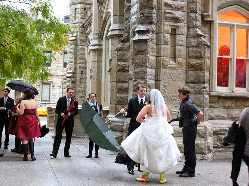
Summer in the City: The Bride Wore White; the Bagpiper Plaid

click images for larger view
It's the kind of thing you encounter in a city big enough to serve as backdrop to the theater of life.  It began with the sighting of a bride and her groom walking past Quigley, in front of a bag-pied-piper leading the wedding party from an unknown church down Gold Coast streets.


 To a reception at the the Drake . . .

Rabu, 16 Juli 2014

Mr. Trump, meet Mr. Loew

click images for larger view
And no, there is no Mr. Loews, but there was a Mr. Loew - Marcus Loew, to be exact - the source of all things Loews, co-founding in 1904 the theater chain which went on to create powerhouse movie studio Metro-Goldwyn-Mayer.  When the Tisch family acquired the company in 1969, they killed the possessive apostrophe and Loew's became just plain Loews, which Tisch brothers Laurence and Robert merged into their growing hotel business, forming the conglomerate still known today as Loews Corporation, which sold off the theaters in 1985.

Photographs taken on the evening of July 16th, 2014, the 10th anniversary of the opening of Millennium Park . . .